Four UX Tactics for More Authentic Marketing Automation

Marketing automation can save organizations huge amounts of time and money, but they can also frustrate your customers. In this post, we explore several automation techniques that can be used to delight—rather than alienate—your users
Marketing Automation Done Wrong
It happens all the time: You sign up for an email alert or download a white paper from a recently discovered website and find yourself caught in an endless flurry of irrelevant and annoying sales emails: Buy this product! Check out this service! Yada yada yada. Inevitable next step: unsubscribe, report spam, delete, go away forever. If the offending act occurs on social networks: unfollow, unfriend, etc.
It’s the scourge of marketing automation done wrong. Instead of increasing brand loyalty and earning respect from customers, many companies unwittingly do the opposite by pummeling new sign-ups with useless auto-generated drivel that doesn’t meet their needs.
Automated Responses Can Damage Your Brand
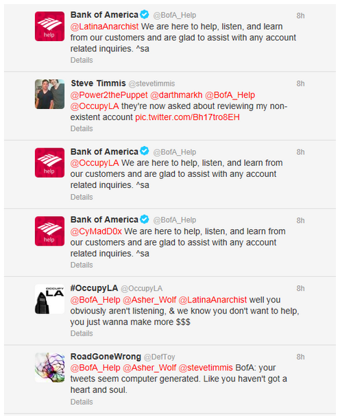
Consider the case of Bank of America, which suffered brand damage when automated responses on Twitter became the target for endless ridicule and led to hundreds of responses baiting their beleaguered bot. The incident was covered by numerous online publications, including Gizmodo, Digiday, and MediaPost, among others.

That said, marketing automation can have value if used properly:
Companies that use marketing automation have a 53% higher conversion rate from marketing response to qualified leads and a 9.3% higher sales quota achievement rate.
— Salesforce
So marketing automation techniques can be used to drive more sales.
Crafting Good Marketing Automation
If you’re tasked with creating these interactions, how can you be sure they create value for prospective customers and don’t get earmarked for the trash bin? It’s simple: successful marketing automation requires good user experience design. There are many UX tactics you can apply to create marketing automation processes that are authentic and useful rather than robotic and wasteful. Here are four of them.
Personify and Personalize
Many marketing automation platforms offer customer relationship management (CRM) functions with robust tools for segmenting audiences and qualifying prospects. These tools allow you to drill way down on customer preferences and attitudes. Some software offerings focus on email campaigns, others on website interactions, while still others will focus on social media. Socially focused platforms will associate a contact with corresponding profiles on social networks like LinkedIn, Twitter, or Facebook.
No matter the focus of your chosen platform, there is rich data to be mined here. What people share or interact with gives you a deeper understanding of the topics that interest them. Contacts can be grouped by topic for more targeted campaigns. Plus, the aggregate data from your contacts list can be useful for creating user personas, helpful documentation that can drive website features and inform content strategy.

While personas serve a useful purpose in defining common traits among users, the more targeted and personalized the interaction the better your content will be received. Do as much as you can to customize interactions and provide a meaningful experience. This could mean pre-filling out web forms, auto-logging in users (opt-in, of course), or simply addressing them by first name in your email correspondence.
Just don’t get creepy about it. These platforms offer deep insights into customer behaviors through website tracking, social interactions, and so on. Great power requires greater restraint. Use the information you glean judiciously.
Offer Great Content
Content strategy and UX go hand-in-hand. Good marketing automation should be rich with great content that drives an excellent user experience. Hopefully, you already have a solid content strategy for the rest of your marketing materials. It applies here, too. Think of user needs at every touchpoint and be sure to provide content that meets—or better yet, exceeds—their expectations:
- Create meaningful unsubscribe and thank you screens.
- Be clever, real, humorous, and transparent in your correspondence.
- Provide free downloads, blog tutorials, fully-functioning trials, and so on.
- Streamline the process of filling out forms.
- Maintain a consistent voice across pages or screens.
You can map these interactions to various steps in a sales process or conversion funnel and make educated, data-driven decisions about how best to proceed.
Adding Value with Additional Content
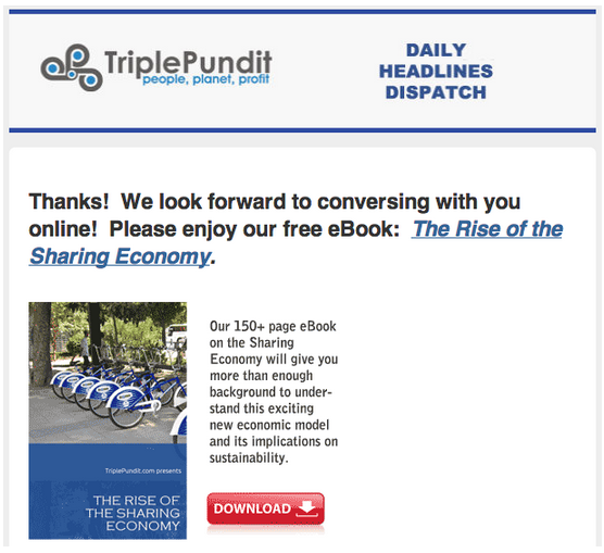
Here’s a simple example: when you subscribe to fellow B Corp Triple Pundit’s email list, they offer a free downloadable ebook on the sharing economy, a topic likely of interest to their readership. It’s a great way to add value and thank someone for providing contact information.

Map That Process
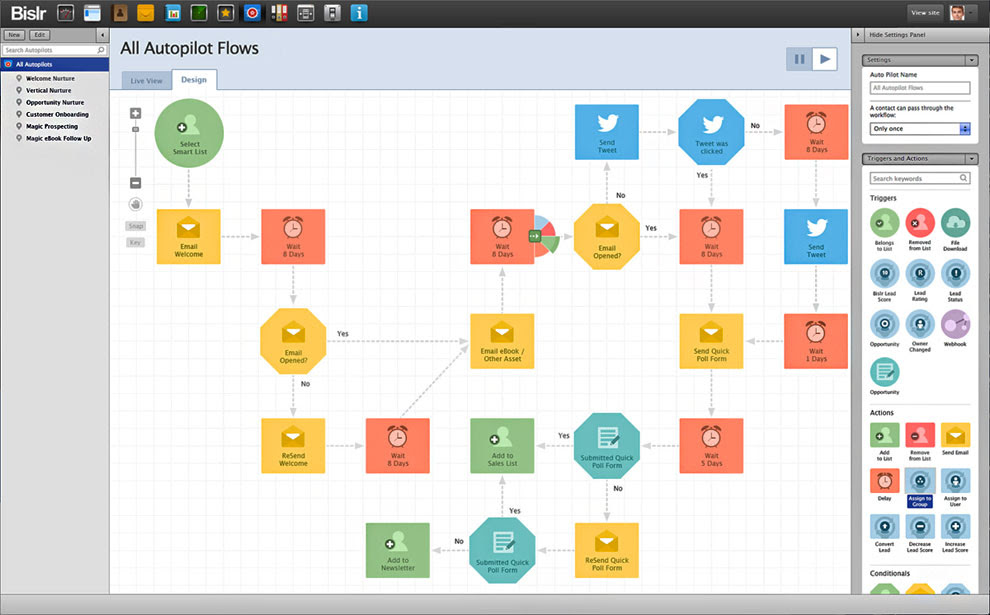
Creating a detailed process map helps ensure you will provide a more valuable experience to the user. Experience mapping involves outlining every desired action you would like users to take and including variations on as many outcomes as possible. Not all users will react the same, so it’s important to figure out what will work for the majority of them and offer contingencies for those with alternate needs.
Good information architecture saves users time and creates a seamless, intuitive, and hopefully enjoyable path through content. However, when marketing automation becomes part of the process things get a bit stickier, as you rely on software to interact with real people on your behalf at key steps throughout. Paying attention to details in this process can make a huge difference in how your content is perceived, as can testing, which we’ll cover below.

Prototype and Test
Prototyping portions of your experience map and testing them with real users can help decipher whether those interactions will resonate with users. If you’ve got HTML and CSS chops, this can be done quickly using several freely available front-end frameworks. If not, don’t fret! Some wireframing and interface design tools allow you to quickly create clickable prototypes from page or component wireframes. Another simple, cost-effective, and code-free way to test your ideas is with paper prototypes. This UX Prototype Pinterest board has all sorts of templates you can use to mock-up interface elements associated with desired user interactions. If you’re still not sure if this process is for you, try a local agency or give us a shout. 🙂
These prototypes can be used to test your marketing automation campaign’s features and content. Ask your internal team or contact a small, targeted test group of trusted contacts to offer feedback. Take notes and track the results. Solicit feedback, or better yet, sit a group of users down in a room and watch them interact with your campaign. Resist the urge to guide them or provide suggestions. You will find great value in testing design and interaction ideas with real users.
A/B Test Campaigns for Better Results
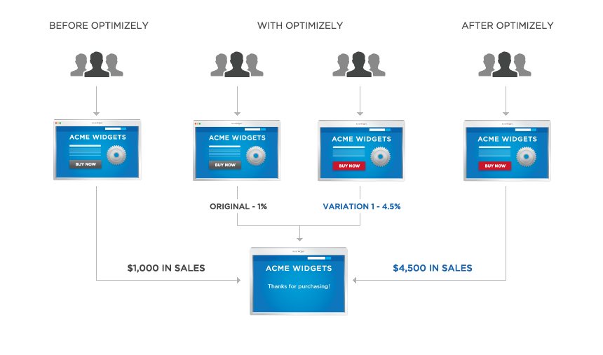
Similarly, A/B or split testing tactics provide extremely useful data when trying to figure out which components of a campaign, landing page, or website resonate with users and which don’t. By segmenting your audience into key groups and testing a variety of combinations, you can figure out what works best with a small audience group then use the best performer for the final campaign.

Go Forth and Automate
I hope these ideas will help you improve the quality of your marketing automation efforts. For more information on UX and prototyping check out our UX design posts or read more about our inclusive experience design services.
Inclusive Experience Design
Learn more about how Mightybytes uses inclusive design strategies to help our clients strengthen stakeholder relationships while meeting their business goals.