How Wireframes and Rapid Prototypes Improve Digital Projects
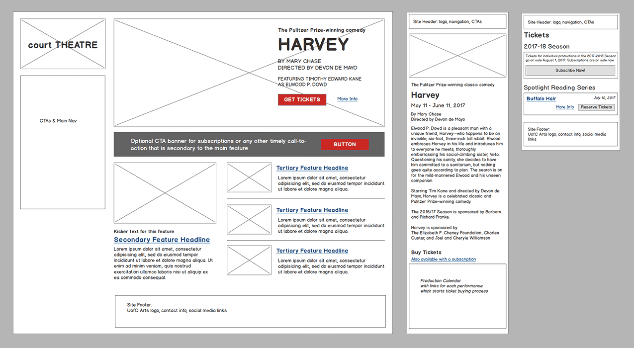
Wireframes and rapid prototypes are the blueprints behind any successful digital product. In this post, we share how wireframes and prototyping can improve your next digital project.
It is not uncommon for a website or digital product to launch and miss the mark:
- Target users are less interested in your content or features than you thought they would be.
- Worse, they can’t find what they’re looking for.
- Other project stakeholders are upset because their favorite piece of content didn’t make the homepage.
- Sometimes, inadequate wireframes and rapid prototypes—or worse, the absence of these things altogether—are to blame.
Regardless, consensus wasn’t achieved and now people are upset. Let’s explore how we can use wireframes and rapid prototypes to achieve consensus—and improved chances for enduring success—on your next digital project.
What are Wireframes?
Wireframes are the blueprints for any digital product component or website page layout. Similar to their architectural counterparts, wireframes help key project stakeholders visualize and better understand specific features and functions for a digital product or service before it is designed or built. They play a key role in successful digital product design.
Wireframes translate common discovery workshop and product roadmapping exercises about aligning business goals and user needs into tangible representations of your product’s features and functions. They are the first step toward visualizing an end product.
Component vs. Page Wireframes
It helps to break big projects down into smaller pieces. Component wireframes help stakeholders visualize individual elements on a page—a newsletter signup box or map visualization, for example.
Similarly, page wireframes help stakeholders visualize how a set of components make up a page layout. This is useful for people who need to visualize a full page. However, with many digital products moving toward design systems and style tiles, plus the advent of block-based editors like WordPress Gutenberg, page components are often easily interchangeable.
Wireframes are not Design Comps
It is also important to distinguish wireframes from their design comp counterparts. Wireframes are not meant to show look and feel or any visual treatment of graphic elements like buttons, headings, and so on. Typically, they are created with little to no color and simple shapes, like boxes and arrows. Often, they also don’t include real copy, though if you adopt a content-first approach to digital projects, they will.
Who Benefits From Wireframing?
Every project has a key group of stakeholders. If you don’t understand who your key stakeholders are, a stakeholder mapping workshop can help.
Let’s take a look at how wireframes can help improve common stakeholders’ understanding of product features and components.
- Users: If you’re unsure how a specific component or feature might resonate with target users, wireframes and rapid prototypes offer a great way to validate website navigation and features with real users.
- Clients: Possibly more than any other deliverable, wireframes help agency clients clearly understand how the components of a specific page or feature work together in the service of business goals and user needs.
- Product Managers: Wireframes and prototypes help product managers visualize new features and functionality as a product is improved over time.
- UI/UX Designers: The wireframing process helps designers better understand where UI elements need to be placed on a page or screen and how content, design, and interactions combine to create successful user flows.
- Developers: Wireframes help developers understand functionality which informs a solid programming strategy. They also offer a more accurate picture of a project’s complexity to help developers better predict the time it will take to complete tasks. This is especially critical when wireframes and user flows are created in a workshop setting.
Aligning Stakeholder Needs
From an agency perspective, wireframing helps project stakeholders understand design challenges and catch potential issues which may arise before a project goes into development. This can save valuable time and and money and remove potential errors before they occur.
Getting stakeholders to clearly understand how a digital product is going to work, look, and feel at the start of a project is challenging. Some stakeholders can’t make impactful decisions until they can visualize and interact with something tangible.
Wireframes help to address this challenge. These deliverables also assuage uncertainty about the level of confidence in a particular component or feature. More on this below.
Most importantly, once wireframe sign-off is received, developers can begin to build out digital product components before the visual interface is completed, again saving time and money.
Wireframe Fidelity
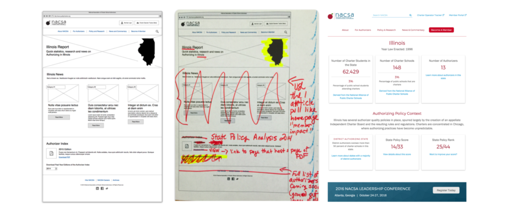
Wireframes can range from low-fidelity, hand-drawn sketches created on a workshop whiteboard to high-fidelity page layouts meant to help project stakeholders understand key functionality and information hierarchy. When and how to apply each really depends on a project’s scope, budget, timeline, and the level of confidence stakeholders have in whether or not a feature idea will resonate with target users.
Let’s take a look at several wireframing options and weigh the pros and cons of each.
Low-Fidelity Wireframes
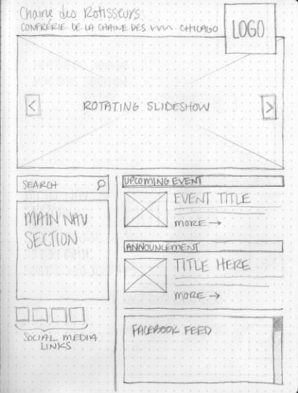
There’s a lot to be said about hand-drawn sketches. They’re quick, easy, and informal. They get ideas across without wasting too much time, which means they can save time and money. However, they’re not perfect.
When to use low-fidelity wireframes:
Whether created on a whiteboard during a workshop or sketched out by a designer shortly after a meeting, low-fidelity wireframes can quickly build consensus among project stakeholders on page layouts and feature ideas. Create them during or after discovery and product roadmapping sessions but before visual design processes begin.
Pros:
- Low-fidelity wireframes save time over their higher-fidelity counterparts.
- Because they are typically hand-sketched, you can make multiple options quickly.
- You can quickly create consensus among multiple stakeholders in a workshop, on a shared virtual whiteboard, or on a video call.
- They are great for components like single features, widgets, etc.
Cons:
- Because they’re drawn on whiteboards or paper, scale is skewed, which makes it difficult to visualize responsive elements across browsers and devices.
- While you can draw lines between page elements on different wireframes, this approach doesn’t effectively visualize interactivity or accurately show user flows very well.
- They are unrefined, which can lead to misunderstandings.
Ideas generated during sketching sessions are intentionally “rough” and early stage. It is important that everyone keep an open mind. This helps people generate many ideas. Unfortunately, these sessions can lead to misinterpretation, especially since valuable information is missing.
However, if a project is simple, like a landing page or new component, a low-fidelity wireframe might be all you need. For more complex projects, you higher fidelity is more effective.
High-Fidelity Wireframes
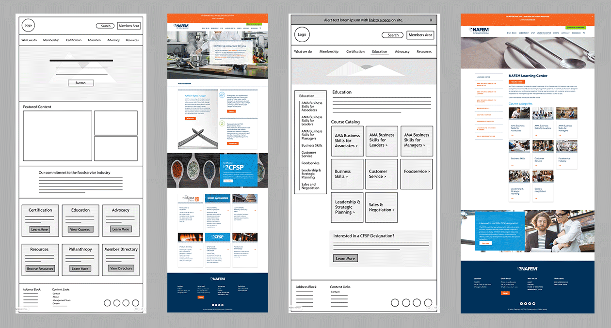
The higher a wireframe’s fidelity, the more information it conveys. However, as noted above, wireframes help stakeholders understand functionality, not design decisions. Thus, it is important that wireframes remain simple and function-forward in how they display information.
When to use high-fidelity wireframes:
Use high-fidelity wireframes when project stakeholders need to clearly understand page layout details or how specific features will work. In tandem with experience maps, user flow diagrams, or customer journey maps, they help stakeholders better understand interactive elements.
Pros:
- High-fidelity wireframes build consensus on key product features and page layouts.
- Once you achieve consensus, execute visual design and product build processes in tandem. This saves time and money.
Cons:
- Higher fidelity artifacts take more time to produce. This eats up design budgets.
- Regardless of fidelity, wireframes don’t often accurately convey interactive elements. This can lead to confusion and misunderstandings.
Rapid Prototypes
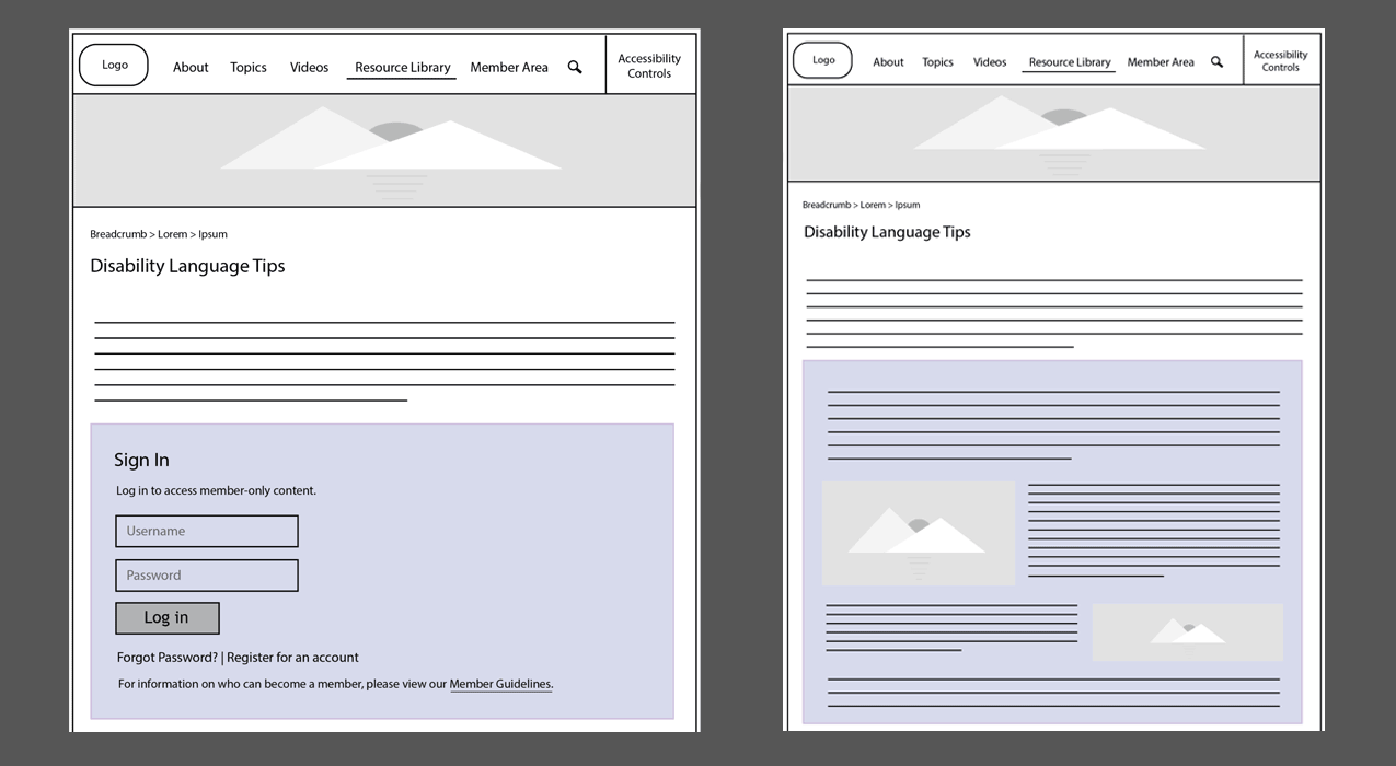
Product teams create rapid prototypes by stringing a series of wireframes (usually higher fidelity) together with clickable ‘hotspots’ that mimic real-world interactions. This helps project stakeholders better understand desired interactivity.
Prototypes may entail some simple programming, though products like InVision make this a quick and easy process, hence the term ‘rapid’.
When to use interactive prototypes:
Visualizing interactivity often answers many questions. Use a rapid prototype when wireframes fall short or you can’t achieve consensus. Perhaps interactions are too complex or include animations not easily visualized with flat boxes and arrows.
Finally, is your level of confidence about user engagement for a certain component or feature low? Not sure if users will like your fancy new shopping cart or ticket purchasing interface? Create a rapid prototype to test it with real users!
Pros:
- Interactive prototypes offer a solid representation of interactivity.
- You can improve and build upon them as stakeholders learn new information.
- Prototypes answer important questions about user task flows.
- They help stakeholders visualize interactive element sizing and placement.
- In some cases, you will save time on front-end programming.
Cons:
- Rapid prototyping takes time. This is challenging when budgets are tight.
- Some still struggle to find value in wireframes and rapid prototypes.
- They aren’t foolproof. Just because you prototype a feature with real users doesn’t guarantee widespread adoption. However, it does significantly increase your chances.
Wireframes, Prototypes, and Sustainability
Finally, lean (and more sustainable) digital development depends on reducing the resources required to design, build, maintain, and retire a digital product or service. There are a number of sustainability benefits to wireframes and rapid prototyping as well:
- They reduce your risk of building something nobody wants. In turn, this reduces the resources required to build a successful product.
- If sustainability principles are incorporated into the process, they help streamline user journeys, which results in improved performance, less energy use, and lower emissions generated from end user devices, the biggest of four systems segments that generate internet emissions. This is especially true for Scope 3 emissions.
- When used in tandem with user testing to build new features, wireframes and rapid prototypes reduce the resources needed to maintain a successful product or service over time.
By employing the tactics listed in this post, wireframes and prototypes become a key part of a more holistic approach to sustainable web design.
Improving Your Digital Products and Services
To conclude, most complex digital projects should support a healthy wireframing and prototyping budget to help stakeholders better understand and visualize a digital product or service before you spend time and resources building it. This builds consensus about what success looks like.
Also, this is especially critical for products with large amounts of complex interactivity. Wireframes and rapid prototypes cut down on future project headaches, which reduces resources and helps you build capacity over time.


