How to Design a Website for Multiple Audiences

We start every web design project the same way: by listing an organization’s business and user goals. Before we move on to sexier things like style tiles and page design, we need to figure out what each website needs to accomplish from an organizational or business standpoint, and what visitors expect to see or do there.
For example, a website for a pizza restaurant needs to sell pizza. Pizza restaurant website users expect to be able to view store hours, a menu, contact information, and place an order online. Listing these goals at the start of every project is the first step in good content strategy and design.
Many Users, Many Goals
Determining audience goals is a simple task when you have a simple business structure, like a pizza restaurant, but many of our clients need to address lots of competing user needs on a single website. This is especially true of nonprofit and government organizations, many of whom have long lists of different audiences with distinct goals. For example, a professional organization may need to address:
- Members seeking information about member benefits
- Potential members inquiring about membership
- Potential sponsors looking for sponsorship rates
- Board members looking for meeting times
- Lawmakers looking for policy information
- Job seekers applying for positions
- Members of the press searching for a press release
- Staff members logging in
Large organizations often suffer under the illusion that if a user doesn’t see content related to their immediate needs on the home page, they’ll exit the site. This simply isn’t true. Users will scroll or click through to find the right information as long as it’s intuitive. So not all content has to have a presence on the home page.
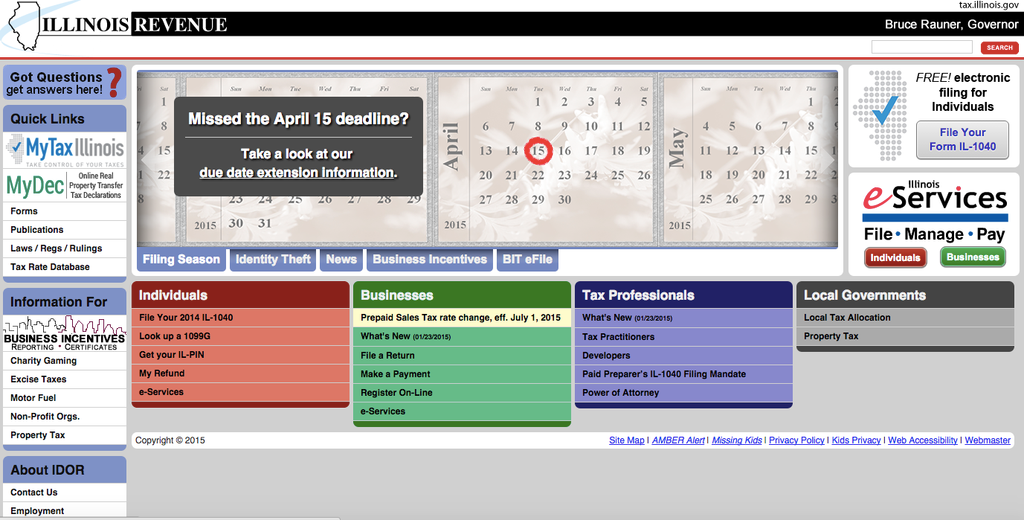
Knowing this, how do we determine the most important audiences for a particular website and how to optimize home page content for them?
Finding Your Primary Users
To find your primary users, start by making a list of all your potential audiences and their goals for using the website. For example, for a museum:
- Visitor looking for exhibition information or hours
- Potential donor looking for donation information
- Current or potential volunteer looking for volunteer information
- Job applicant looking for open positions
- Board member seeking financial or meeting information
- Event coordinator seeking event information
- Member of the press looking for recent releases
- Fan seeking social media information
- Children participating in online learning programs
- Potential or current sponsor seeking sponsorship information
Of course there are more audiences, but that covers the basics.
From your main list, you now want to determine whose needs you’re going to try to meet with specific home page content. While you may have as many as 10 types of users accessing your site, not all 10 are “primary” users. Members of the press, for example, won’t need a clear call to action on the home page, as they’ll know to search for a press link in the footer.
To arrive at the right home page content, make a list of only your primary users.
Some ways of identifying who your website’s primary users are:
- Group audiences and goals that can live in the same area. For example, a job applicant looking for job information and an applicant looking to apply would go to the same area: careers. Similarly, be careful not to lump together the same audience with different goals. For example, a restaurant patron may be looking for business hours, wanting to make a reservation, book a private event, look at a menu, or order online. All these are distinct goals that should be served by different sections of the home page.
- Separate any groups of people who don’t usually visit your website through the home page. For example, donors to Kickstarter campaigns hardly ever see Kickstarter’s home page. Consider various entry points and optimize those landing pages for ideal user experience rather than including those calls to action on the home page. Consider all your potential secondary entry points.
- Are there primary users for whom a visit to the site becomes routine? You won’t need to design a home page for them because they will quickly learn how to find the right content. For example, organizations for whom the primary call to action for a secondary group of users is “log in.” These users know to find that information in the top right corner.
Drilling Further Down
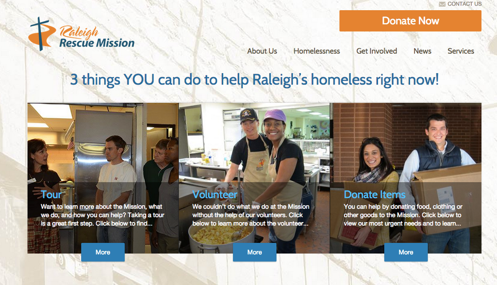
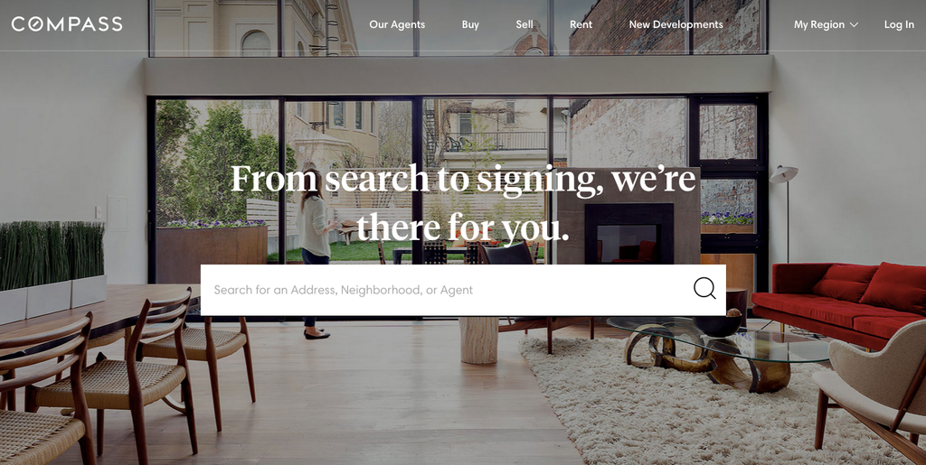
Now you have a whittled-down list, but you may still have several competing audience groups. As we’ve seen with examples like the Raleigh Rescue Mission, you can design a home page that works well for as many as four primary audiences. But ideally, as with the Compass example, identifying a single audience for whom the main content or call to action will be written is quite helpful.
Here are some ways at arriving at a single primary user:
- Create a poll for stakeholders. Present your edited list and have everyone vote on who they think is the most important audience. You’ll be surprised sometimes at the quick consensus!
- Who is the most important audience for conversions? For example, a library may be tracking how many catalog searches are performed in a month, or how many e-books are borrowed. Therefore those activities would be prioritized over finding story time hours on the website.
- Who accesses the site with the most frequency? For museums, donors may be the most important group when it comes to conversions, but visitors seeking exhibit information and hours make up the majority of traffic, so it’s probably best to treat them as the primary audience.
Rely on Standard Placement of Home Page Content
Remember that certain design elements are almost always placed in the same area of a page, and so you don’t need to carve out prime real estate on a home page for them. For example, with the exception of banks and credit card companies, login buttons tend to be at the top right. Career, Contact, and Press information usually lives in the footer. Donate buttons tend to live in the top right corner.
If you filter these intuitive locations, you’ll be left with only a few pieces of content that require special consideration for the home page; this is likely your core audience and primary call to action.
You Have To Choose
A home page that serves too many masters ultimately serves no one. It is always better to design a website that is optimized for a particular user group than compromise on a jumbled mass of content with no clear calls to action or navigation. When you operate under an institutional mandate that all needs be served immediately on the home page, you deviate from content strategy and UX standards, meaning that ultimately your website meets no one’s needs.

