How Flat Design Makes Your Website More Sustainable
Flat design strips away unnecessary elements, such as gradients, beveled corners, and so on. In this post, we explore why this approach is also eco-friendly.
Flat design is everywhere. Companies like Microsoft, Google, and Apple have moved to flat design websites or flat design operating systems. Its clean approach strips away needless elements that distract users. Plus, it also puts content-first, which is better for users.
But flat design is something else, too. It’s an eco-friendly approach to web design. Here’s how small changes to individual design elements can improve your site aesthetically and reduce asset size, allowing pages to load faster and reducing environmental impact.
Flat Design Buttons

When creating flat buttons, the idea is to use no imagery, gradients or drop shadows, just a flat color — a square or rounded corner button — and the button call to action. By not using a background image in your button you remove the HTTP request to the image — and that uses less energy to create the button on screen. Flat buttons are created with code, and therefore use less energy than an image to render.
Flat Design is Content-First
Flat design can go a long way in helping your site’s functionality and readability as well as being more energy efficient. Check out Microsoft’s old search page vs. the new, sleeker version.
By removing gradient colors, and, in the case of the form search bar, the buttons altogether, the page focuses more on the search content (what the user is ultimately looking for) and creates a more readable page.
Background Colors in Flat Design
It used to be that using gradient imagery or large, full-screen background images in the background of a site was all the rage. But this approach can lead to heavy page load times. This increases server loads and uses more energy. By switching to flat colors, you can create a cleaner direction to content that helps visitors find your content (or products) faster.
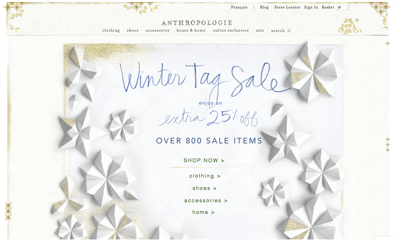
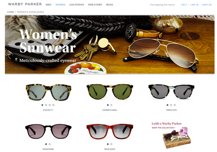
Using Sprite Icons
Using a sprite sheet for all your icons can reduce overall page size and help your site load time. It reduces the HTTP requests for multiple icons down to one file. To learn more about sprites check out the Smashing Magazine’s article CSS Sprites Revisited.
By placing your flat icons into a sprite sheet you can create beautiful and seamless icons that help visitors quickly identify useful information as well as reduce page size.
Not sure where to start with flat design?
Check out these great resources:
- Flat UI Framework built on Twitter Bootstrap – by DesignModo
- Featherweight UI – a free vector based retina ready kit
- For flat design inspiration check out Dribbble
- 180 Free Flat Icons to jump start your project
- Check out the newly launched Black Tie which includes several free flat design Word Press templates


