Green Patterns: Helping Users Make More Sustainable Choices

In this post, we will discuss options for creating digital products and services that serve the needs of both people and the planet without being disruptive or deceptive.
Both sustainability and UX design are dedicated to creating great experiences for people. For experiences to be both people and planet-friendly, more sustainable choices should be easier to make than their less environmentally-friendly counterparts. But when crafting user experiences, is making choices for users a wise move, even if those choices promote more sustainable behavior?
Easy Being Green
We’re using words like engagement, performance, accessibility, security, conversion, technical debt, and privacy every day to evaluate our decisions and tradeoffs. However, we rarely hear the word sustainability in product discussions.
— Artiom Dashinsky, Product Design for Sustainability
While security, conversions, accessibility, and privacy are obviously necessary to create successful digital products and services, making sustainable choices should be simple and the options clear for users. This is something rarely discussed during UX workshops or product brainstorming sessions.
Here’s a real world example: if you have a trash chute just down the hall from your apartment yet the recycling bins are in the building’s basement, you are far less likely to recycle than if the situation were reversed. Placing recycling bins in easily accessible areas will encourage more environmentally responsible behaviors.
Shouldn’t we take the same approach with our digital products and services?
Choice Editing
Choice Editing refers to the practice of controlling or limiting choices so as to drive an end goal. In the past, choice editing has been used to ban or tax specific items, and it can be a common practice when creating dark patterns, which are meant to deceive users into making choices not necessarily in their own best interests.
When choice editing, the line between dark patterns and “green” patterns can sometimes be blurred. For instance, adding carbon offsets by default to a checkout process would be considered a dark pattern. Even though carbon offsets may be a more sustainable choice, users should have the option to make that choice themselves rather than it being made for them.
Here are six examples of green patterns in action.
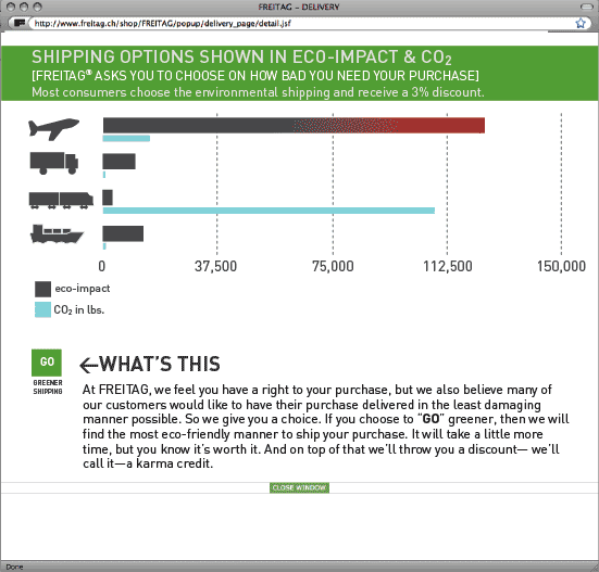
More Sustainable Shipping Options
During a checkout process, give users the option to choose a more environmentally-friendly shipping option by highlighting that option in the interface and, if possible, offering an incentive to users who choose it.
Product Highlighting
When users search for specific items, why not highlight the most environmentally products first in search results? This is also an opportunity to provide incentives through discounts for users who select those products.
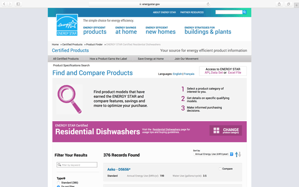
Product Sorting
Include options for sorting products in e-commerce searches by “greenest first”. Similarly, adding certification logos—such as Fair Trade, B Corp, Green America, and so on—to product listings can help users more easily discern products that share their personal values from those that don’t.
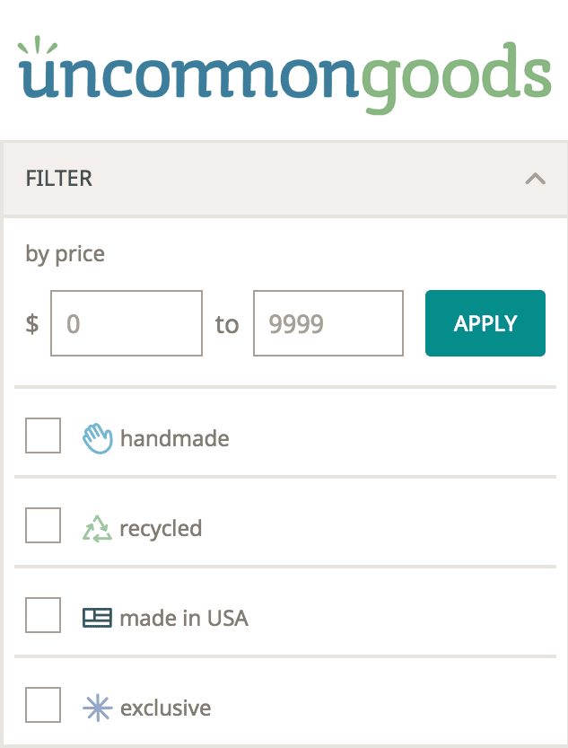
Buying Local
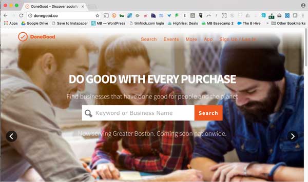
Help users find local sources for goods or services. DoneGood, a startup and certified B Corp out of Boston, helps users support local companies as well as guide them toward companies that support diversity, give back to their communities, support workers, or offer organic products.
Similarly, retailers could highlight these options during shopping and checkout in their own digital products, which offers potential for a much broader reduction in impact.
Sustainable Travel Options
Map and transit apps commonly give users options for the quickest route between two points, often defaulting to car travel as the desired mode of transportation. Unless they are specifically geared toward public transit, few apps highlight the more environmentally-friendly travel choice first. This could be a great opportunity for local planning councils and civic organizations to partner with tech companies to provide incentives for users who take public transit, ride bicycles, or walk.
The Printing Experience
People do still print web pages. Commonly printed pages include recipes, bank statements, contracts, FAQs, and yes, even maps and directions. Designing these pages without considering the resources necessary to print them is doing a disservice to everyone but the paper manufacturers and ink cartridge makers.
Rather than relying on default browser printing options, designers should think about how they can use the least amount of resources while still providing acceptable printing results. To do so, print should be treated equally alongside other media types, like screen and speech.
Although most browsers will by default change colors automatically to save ink when printing, this is often not as effective as a custom solution. Design print stylesheets to minimize paper or ink waste by checking width/height of viewport or device, landscape or portrait orientation, screen resolution, and so on.
Just a Start
These are just a few UX tactics online retailers and product managers can do to lessen the environmental impact of their digital products and services. The important thing is to get digital product teams thinking about sustainability alongside other metrics when considering success factors.
If you liked this post, you might want to check out our comprehensive overview of sustainable web design. It features many similar resources.
New Ecograder, now in beta
Improve the performance, efficiency, and environmental impact of your digital product or service. Our new beta offers a better experience, new features, improved data visualization, plus the ability to track metrics over time for up to 100 pages.
