Stop Writing Web Copy That Over Explains Everything

In this post, we share why clear, simple, easy to understand web copy that can be skimmed is always best. We also cover how to incorporate it into your next digital project.
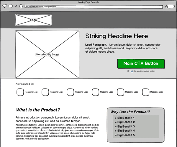
On website redesign projects, web copy and page layouts are often developed separately. If page designs are approved before copy, this puts content creators in a bit of a bind. They have a client-approved design mandate to write text in certain “buckets” on the website, but sometimes, text just didn’t belong there.
Why We Write Such Bad Web Copy
Sometimes, important ideas on a page can be conveyed by design alone. When a writer tries to add copy based on a design mandate, that copy is often redundant. Without a real need to communicate, writers write explainer text to introduce design elements. Rarely is this copy helpful.
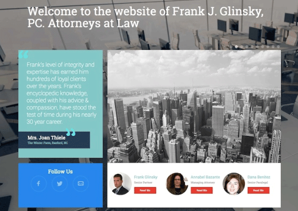
You see this copy on the web all the time, but you’ve mostly learned to ignore it. It wasn’t until we made a conscious effort to “show, don’t tell” with our designs that we started to notice how often copy on a website literally welcomes you to the website, as if you’ve been on a long journey through the tangles of the World Wide Web and finally arrived at your destination. A print ad wouldn’t read, “Welcome to the print ad we purchased in this magazine.” But when it comes to writing for the web, people have a tendency to get literal. It’s not the designer’s fault. In fact, designers sometimes write placeholder copy that’s good enough to end up in the final design. But they’re more focused on the visual elements of the page than the words. Because of this, “welcome to my website” sometimes ends up in the final deliverable.
The ‘Click Here’ Issue
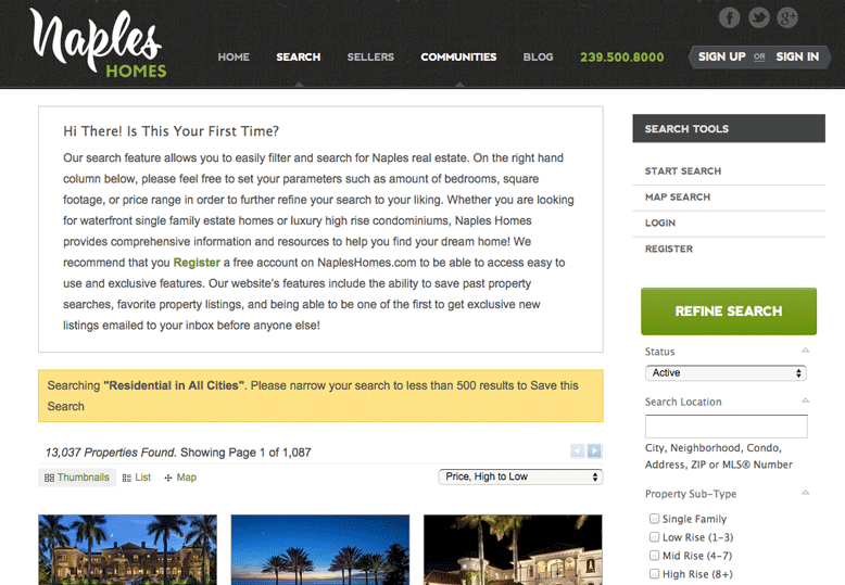
Web writers inherited bad habits from the early days of the internet when site visitors may not have known what a hyperlink did. People who have an interest in setting web standards have been on a campaign for years to get people to stop writing “click here.” But it’s harder to curb the unseen ways in which explainer copy creeps over buttons, web forms and other design elements. There are far better ways to create compelling calls-to-action.
Clear, descriptive copy on links and buttons also helps people with disabilities—who sometimes use assistive technologies like screen readers—more easily understand what will happen if they click a link or button.
If a designer and a content strategist prioritize content when creating wireframes, it’s easier to avoid writing copy where none should exist. If you don’t inherit placeholder “lorem ipsum” copy, you don’t have to rewrite it.
Writing For the Web is Actually Really Hard
Still, even when designers and writers work in tandem, it’s hard to figure out where design ends and copy begins. Writing for the web is unlike writing for any other medium. On certain page elements, a writer has to combine the skills of a persuasive ad copywriter with the skills of an icon designer, writing copy that not only explains the direction a website visitor should go, but why they should go there. Designers are lucky to have a library of symbols to fall back on when they need to communicate complex ideas. While there are some widely accepted content standards around writing button copy, for instance, those same standards don’t exist for, say, writing headlines for a pricing chart.
I was recently working with one of our designers on an element for a client website. The wireframe looked something like this:
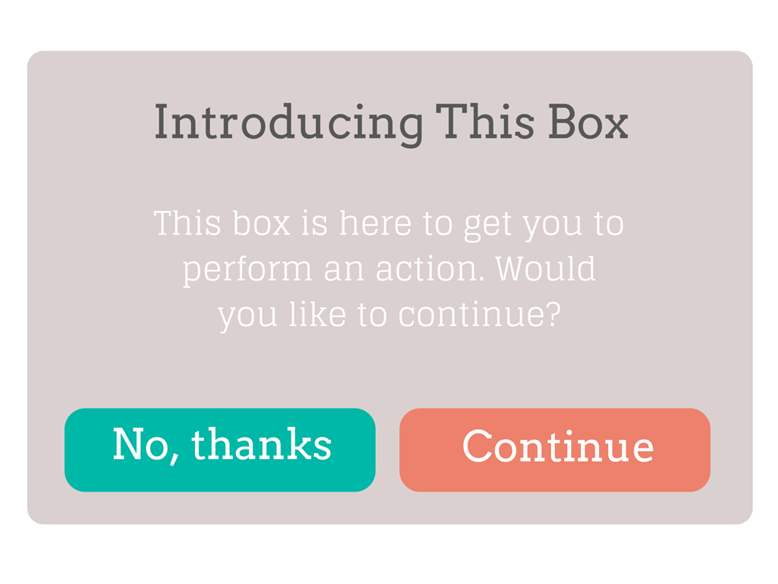
When the user clicks “continue,” they land on a much larger web form. So the box needs to not only explain that clicking a button will lead the user to an exciting form-filling destination, but it needs to entice the viewer to start the process of filling out that form (leading to a conversion). That’s a tall order. Now combine that with inherited placeholder text and you not only have to explain and entice, but you have to do that with a headline, secondary copy, and two buttons.
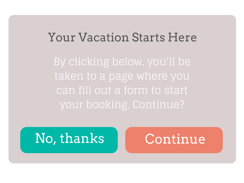
This wireframe looks ridiculous, but it’s not uncommon to see web copy over explaining page elements like this. In fact, almost every website does it somewhere because writers and designers aren’t working together to create elements that make sense for website visitors. Working together, we came up with a different approach—one with simplified copy and only a single button. It’s not perfect. The button could read Book Your Trip or something more descriptive—but it’s a running start.

Trust That Your Visitors Know What To Do
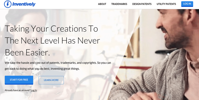
We need to trust that users know what to do with a button, and that if we design the right interfaces, once they click that button, they’ll continue to move through the funnel. Your website visitors know how to close a window, fill out a form, adjust sliders, and generally interact with web interfaces. So we need to design and write with that trust in mind.
Try It Without Copy
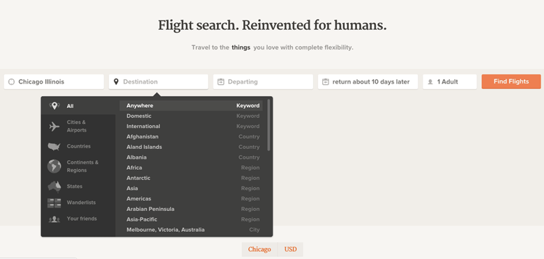
When designers and writers combine efforts, it’s easy to see places where copy doesn’t need to exist. It’s hard to get over the “Welcome to Our Website, Click Here to Learn More,” mentality, but if we design intuitive interfaces that make sense, we won’t need copy to explain them.

This might sound terrifying to content strategists who think designers can design them out of a job, but it’s just as important for content strategists to tell us when we don’t need text as much as where we do.
How to Break the Habit
It’s easier to stop writing bad web copy if we’re aware we’re doing it. Here are some things to keep in mind when writing for the web:
- Take a “content first” approach to any website project. You don’t need to write everything up front, but spending some time on your content strategy and how you’ll execute it as part of the redesign will get project stakeholders on the same page before a single design is created.
- Don’t write copy that explains how to interact with elements on the page. Good design will take care of that.
- Trust your users. Stick to writing copy that satisfies the reason they’re visiting your page by talking about what you’re there to talk about: your product or service.
- Stop writing “Welcome” pages. While a good “thank you” page still has a purpose, a welcome page, or page element, does not. Stop writing them.
- Break out of design mandates. If a designer designs you into a corner, work together to recreate an element so you’re not forced into writing too much copy.
- Keep it simple. Easy to understand copy written in clear, simple language is better for everyone, including users with disabilities, who could represent 15% to 20% of your overall users.
- Test your copy. If you’re unsure whether your sparse copy is enough, run an A/B test or schedule user testing sessions. Watch as people interact with your website (get a mix of ages and experience levels) to ensure that visitors know how to move through your virtual space.
Remember that writing better copy is an ongoing practice. Plus, webpages are living documents that can always benefit from an upgrade. Don’t be afraid to revisit old posts, even if they are evergreen, to make improvements.
Sustainable Marketing
Learn more about how Mightybytes uses responsible data strategies and sustainable marketing practices to help you meet your goals.