How Web Content Accessibility Guidelines Improve Digital Products
In this post, we explore how you can use the Web Content Accessibility Guidelines (WCAG 2.x) to make your website and other digital products more inclusive and accessible for everyone.
There are an estimated one billion people around the world with some sort of disability. In the U.S. alone, that number could be as high as 20% of the population. Also, many people with disabilities rely on assistive technologies to access content:
- Screen readers
- Magnification software
- Head pointers
- Motion or eye trackers
- A pair of reading glasses
- And so on . . .
Whether simple or complex, these technologies are designed to help people with a wide range of physical disabilities access content. What’s more, people with cognitive disabilities might have difficulty interpreting complex content. In other words, digital accessibility is not just about how your content is displayed, but also about how it is written.
To clarify, if it isn’t designed inclusively, people with disabilities may have difficulty accessing web content in meaningful ways. This can create barriers to important information, which includes anything from purchasing groceries, ordering a pizza, or reading a blog. In some cases, like healthcare, lack of access to information can be life-threatening.
How you create and manage content can make a huge difference for many people. Do you really want to risk alienating up to one-fifth of the population?
Accessibility Lawsuits on the Rise
Additionally, an increasing number of web accessibility lawsuits have ruled in favor of plaintiffs. Overall, ADA Title III lawsuits—which includes website accessibility—have increased steadily in recent years.
At Mightybytes, we have received more digital accessibility requests from clients than ever before. As always, we recommend that our clients adopt the Web Content Accessibility Guidelines 2.x (WCAG 2.2 as of this writing) and incorporate them into day-to-day operations as quickly as possible.
So, what does that mean for people tasked with creating and managing digital products? Let’s take a look.
Using Web Content Accessibility Guidelines to Improve Digital Products
First, the World Wide Web Consortium’s (W3C) Web Content Accessibility Guidelines (WCAG) provide a framework for website and digital product owners to begin making their content more accessible to people with disabilities. WCAG 2.x covers a wide range of recommendations for making online content more accessible.

The guidelines have three levels:
- A: The easiest level to achieve, this improves accessibility for most sites by making it easier for browsing readers to navigate a site and translate its content, but it is still pretty basic.
- AA: This level makes content accessible to people with a wider range of disabilities by providing guidance on color contrast, error identification, etc. This is the level most encouraged by the W3C and the U.S. Department of Justice (DOJ).
- AAA: The highest level, this makes content accessible to the widest range of people. However, it can also significantly alter a product’s design.

The Principles Behind Web Content Accessibility Guidelines
Most importantly, WCAG 2.x is driven by four primary principles that are not technology-specific:
- Perceivable: Information and user interface components must be presentable to users in ways they can perceive.
- Operable: User interface components and navigation must be operable with a variety of tools.
- Understandable: Websites must use clear, concise language and offer functionality that is easy to comprehend.
- Robust: Websites should work well enough across platforms, browsers, and devices to account for personal choice and user need.
Each guideline includes several recommendations specific to its category. In other words, websites adhering to these principles will be more accessible for people with a wide range of disabilities. Incidentally, they also make web content more usable overall. Finally, accessible website are also easier for search engines to crawl. Embracing digital accessibility as part of your overall digital strategy is a more sustainable strategy as well. There is no downside to making your web content more accessible.
Let’s explore each of these principles in more detail.
Perceivable Web Content
You need to present content in ways that are perceivable to a wide variety of users with their own unique circumstances. Also, people use a wide array of devices, browsers, and assistive technologies to access your content. These must be considered when creating perceivable web content.

How do I make my digital products more perceivable?
To elaborate, here are ten things you can do to make your website content more perceivable to users of all abilities:
- Alt text: First, add descriptive alternative text to all images on your product or website.
- Resizing text: Give users the ability to resize text without breaking page layout or structure.
- Audio/video controls: Allow users to easily turn audio or video off, if irrelevant to their experience.
- Captions and transcripts: Always add captions and transcripts to audio or video content.
- Proprietary tech: Avoid Flash or other proprietary technologies.
- Visual hierarchy: Display content in sequential order with a visual hierarchy that is easy to understand.
- Simple layouts: Keep page layouts simple and intuitive without extraneous content or complicated interactive components.
- Provide context: Use text in addition to colors and shapes to provide context when possible. Colors or shapes are not the only ways people determine meaning.
- Text in images: When flattening text into images, be sure it is for decoration only and not to convey meaning. As above, as noted above, use alternative text whenever possible.
- High-contrast text: Finally, create high-contrast between text and background colors.

Operable Web Content
Next, users of all abilities must be able to navigate your content and user interface components in ways that make sense to them. Not everybody uses a mouse. Not everybody has a touchscreen. Be sure everyone can navigate your content with ease no matter the devices they use.
How do I make my digital products more operable?
Here are five ways to make your content more operable across devices and platforms:
- Keyboard functionality: First, make all functionality, especially navigation, is easily available from a keyboard.
- Time to comprehend: Provide users with enough time to read and use content. Avoid quick moving banners and allow users to return to content or stop motion altogether.
- No flashing: Do not design content in a way that is known to cause seizures.
- Intuitive navigation: Provide ways to help users navigate, find content, and determine where they are. Descriptive page titles, sequential order of pages, understandable links, and ability to bypass blocks of content that are on multiple pages can help with this.
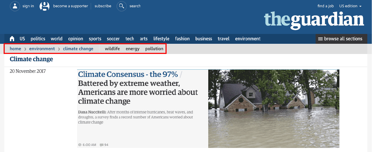
- Breadcrumbs: Finally, include breadcrumbs and other navigation components that help users easily understand where they are.

Understandable Web Content
Next, content and functionality should be easily understood by users. Embrace clarity and concise communication at all times. Content should always be easy to comprehend.
How do I make my digital products more understandable?
To clarify, here are four ways to make your digital products more understandable:
- Readability: First, improve the readability of text-based content. Avoid overuse of abbreviations, jargon, and a content reading level higher than 9th grade.
- Predictability: Make site pages appear and operate in predictable ways. Make sure navigation and component functionality are consistent across your site and be sure content doesn’t change unless a user does something specific to achieve an expected result.
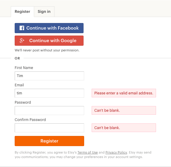
- Input assistance: Help users avoid and correct mistakes by offering input assistance. Clear instructions and suggestions for rectifying common error types can go a long way in helping users of all abilities quickly get what they need.
- Form validation: Finally, include form validation that clearly explains what users should enter into fields.

Robust Web Content
Next, maximize your website or digital product’s compatibility with current and future ‘user agents’ to ensure you meet criteria for this guideline. A user agent is software that acts on behalf of a user to retrieve and render content. For example, web browsers are user agents. However, because they interact with the browser and not your website, screen readers are not. This can bring unique testing challenges for accessible content.
How do I make my digital products more robust?
First and foremost, follow established web development standards. This will help you maximize compatibility with assistive technologies. A standards-based website with clean code will offer a more robust experience across a wider array of devices and platforms.
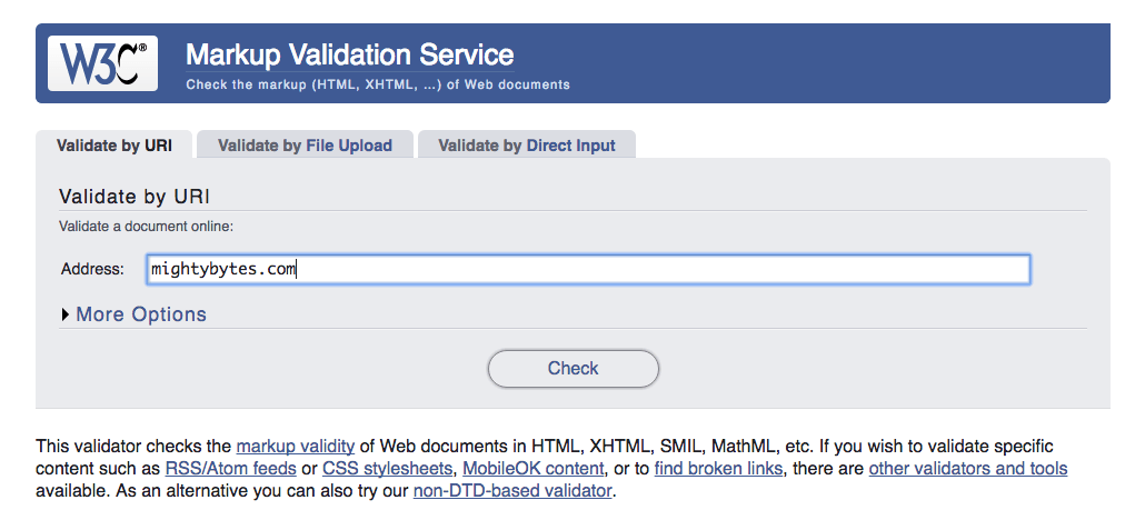
To do this, use the W3C’s markup validation service to ensure your site complies to current web standards. This will give you a good baseline for standards-based code. Also, be sure to clean up any incomplete tags, duplicate elements, and so on.
Better yet, maximize your accessibility investment and improve content quality by manually testing content using people with disabilities and real assistive advices (versus emulators). At Mightybytes, we partner with our clients at Access Living whenever possible to ensure that the digital products we deliver adhere to web content accessibility guidelines and can be properly interpreted by assistive technologies.

Getting Started with WCAG 2.x
Most importantly, maintaining accessible digital products is an ongoing concern that needs appropriate time, consideration, and resources.
To get started, consider taking these steps:
- Accessibility audit: While no replacement for the manual audit of an entire site, online accessibility tools can quickly give you a baseline from which to gauge time and workload. Try AChecker or WebAIM’s Wave tool for starters.
- Create a plan: Outline priorities and timelines for each of the above guidelines. It is inevitable that some things on your checklist will be easier to implement than others. Prioritize.
- Implement changes: Make improvements in small, manageable chunks based on your available resources.
- Train your team: Get company stakeholders on board with keeping your website and other digital products compliant.
- Embrace transparency: Finally, make sure everyone knows this is a priority for you and your organization. If you’re in the process of transitioning your website, post something saying as much. People will appreciate knowing that.
To recap, while this is a simplified description of what is an ongoing and time-consuming process, it covers the basics. Hopefully, it will help your organization and its stakeholders build consensus on accessibility priorities for your digital products and services.
Creating an accessible website is such an iterative process. It’s not a process that happens overnight by any stretch of the imagination. And I really appreciated learning about how to make the most of a piece of real estate online and make it as accessible as possible, but also recognizing that we live in a world where access needs conflict.
— Emily Ladau, author of Demystifying Disability: What to Know, What to Say, and How to Be an Ally
Web Content Accessibility Guidelines: Last Word
To conclude, making your website’s content accessible and useful to as many people as possible, including people with disabilities, is a morally responsible—and, in many cases, legal—thing to do. It is difficult to determine how many people with disabilities use your site, not to mention ethically questionable. However, there are plenty of steps you can take today to push your organization in the right direction.
Plus, by offering people better experiences, they are far more likely to become repeat visitors and passionate advocates for your brand. Moreover, following the above guidelines will ensure your content can be more easily crawled by search engines, which helps people find your content. Why alienate as many as one billion people in the world when you can be sure your content is as inclusive and accessible as possible?
Finally, if you need help, Mightybytes offers website accessibility services to ensure that digital product content is accessible, inclusive, and adheres to WCAG 2.x at whatever level makes the most sense for your organization. If you need hands-on help making your site or products more accessible, please feel free to contact us.
Accessibility Services
Learn more about how Mightybytes helps our clients reduce risk and improve usability with more inclusive digital experiences.