Why Heading Tags and Content Structure Matter

How you structure page content matters. In this post, we’ll explore why heading tags and good document hierarchy practices are not only good for users but better for search engines and screen readers as well.
Good content structure helps both people and technology—such as search engines, screen readers, and so on—interpret your site. Using appropriately ordered heading tags—H1, H2, H3, etc.—in your web pages makes it easier for people to understand them, especially for people with disabilities who rely on assistive technologies to browse the web. Similarly, search engines rely on these tags to interpret what your website is all about. Managing and maintaining clear content structure is an essential part of a good content governance plan.
Follow these simple guidelines to make sure all your site pages have clear structure and hierarchy to keep humans and robots alike from getting confused.
Heading Tags for People
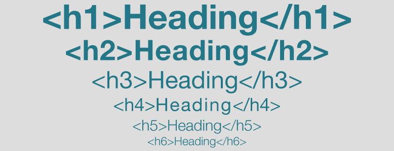
Since heading tags tend to be styled differently from, say, body copy, people look to those visual cues—e.g. a reduction in font size—to indicate how a heading and its content fit into the larger structure of your page. On most websites, headings and subheadings get progressively smaller as heading tag numbers get larger. In other words, visitors will see the H1 as the most important heading on the page, H2’s as subheadings of the H1, H3’s as subheadings of H2’s, and so on. This helps readers consciously (and subconsciously) understand the information faster.
Heading Tags for Search Engines
Search engines use heading tags to determine how page content is structured. They also know that headings typically summarize the most important information on a page, so they will reference those tags to figure out what content sections are about. This is why SEO professionals include important keywords in their heading tags so that search engines can more easily interpret page content. That said, heading tags aren’t the only place search engines look for keywords.
Heading Tags for Screen Readers
Screen readers also reference heading tags to understand how page content is structured and properly present the information to a user with disabilities. A screen reader will pick up on the code and tell the user that there is a heading (e.g. beeping, announcing the level, etc). Screen readers also use headings to navigate quickly through content, so users can jump from one heading to the next easily. When the heading tags are incorrectly used, search engines and screen readers get mixed up about how content is structured and prioritized on the page. This can result in a confusing user experience and increased page abandonment rates. Good heading tag use is only one of many techniques you should employ to make your website more accessible to people with disabilities.
How to Create Good Content Structure
When adopting good content structure practices, here are a few things to keep in mind:
- Don’t simply put section headings in bold. Be sure to use heading tags (H1, H2, etc.)
- An H1 heading tag serves at the ‘title’ of your document. Use it only once.
- H2, H3, etc. tags, on the other hand, can be used multiple times. Just be sure to follow a natural document hierarchy, as described above.
- Writing tools like Word, Pages, or Google Docs can show you a document outline to help you visualize page hierarchy before importing it into a content management system.
- Similarly, if you’re about to undergo a site redesign, a tool like GatherContent can help greatly with properly structuring content for the new site.
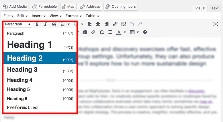
- Content management systems like WordPress offer simple visual tools to help you style page section headers accordingly.
Governance Over Time
If you’re not careful, improper heading tag use can easily get out of hand, especially if, like ours, your blog or website includes many contributors over a long stretch of time. It can be easy for these simple rules to get lost in the shuffle of many people creating and posting content. Before you know it, your pages are a hot mess. To counter this, make sure that content governance documents, like editorial and content guidelines, for instance, include information on proper use of heading tags. Otherwise, it might be time for a content audit. Over time, consistent use of heading tags improves visual display of content, boosts SEO, and improves accessibility user experience. Score!
Need help cleaning up or properly structuring your content? Check out our content strategy and information architecture services and SEO services.
Get Our Web Accessibility Pocket Guide
This free download contains an introduction to web accessibility and a handy checklist of ways to improve it on your site.
Download Pocket Guide
