Rails-to-Trails Conservancy
Mightybytes went above and beyond to meet the needs of our organization, and it shows. We are extremely pleased with the final product and the positive feedback keeps rolling in.
Brian Gerhardstein | Manager, Online Media | Rails-to-Trails Conservancy
Here’s how Mightybytes helped a national nonprofit better engage their constituents to improve fundraising and advocacy efforts.
Rails-to-Trails Conservancy (RTC) does the inspiring work of converting old rail lines across the United States into multi-use trails, encouraging active transportation and finding healthier ways to connect people and communities. With many stakeholders and no clear information hierarchy or calls-to-action, their website, however, didn’t chart as clear a path for users as their incredible rail-trail work does for cyclists.
By trying to please too many stakeholders, a common nonprofit challenge, RTC’s website didn’t help visitors easily find information, which caused page abandonment and missed opportunities to increase donations or capture newsletter signups and trail advocacy actions. The RTC team turned to Mightybytes to help them redesign their website so it better serves multiple users while also empowering the organization to improve key goals.

Discovery and User Research
RTC has an extensive library of online resources related to trail building, policy research, advocacy, and trail usage. Many different types of people access this information. To better understand how we might improve information architecture so users can find what they need while also structuring calls-to-action that drive organizational goals, Mightybytes conducted discovery workshops and extensive user research. During this process, we learned that while all users were interested in rail trails, each visited the website for very different reasons. Mightybytes helped RTC identify content and navigation options that would engage all users without alienating key constituents. This made it easier for different user personas to get their needs met.
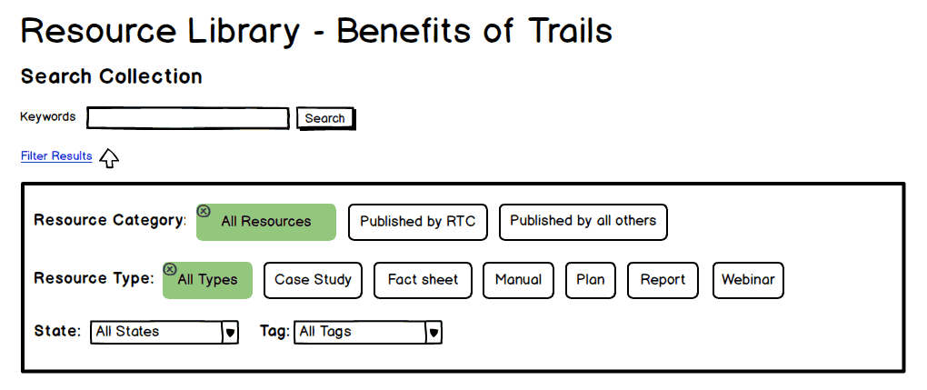
Wireframes and User Experience
To move this project forward quickly and keep it on budget, we created wireframes and style guides in lieu of pixel-perfect design comps. This helped us quickly implement navigational changes based on client feedback and user testing. These efforts validated assumptions about content structure and navigation before we completed final design rounds, ensuring a better user experience that encourages visitors to find and share content.
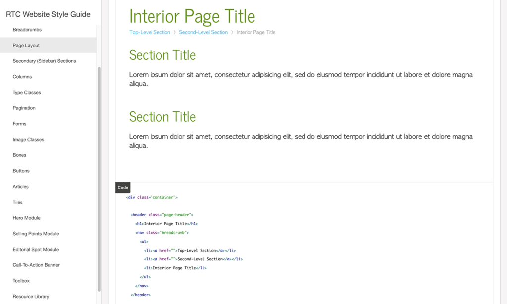
Detailed Style Guide
It was important that we empower the RTC team to make changes and site updates on their own moving forward, so Mightybytes built them an interactive style guide that includes all of the website’s common styles. With this handy tool, site admins and other web developers can match component styles with copy-and-paste ease.
Powerful New Tools
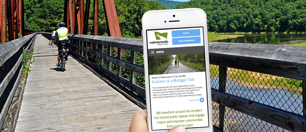
With the site in place, Rails-to-Trails Conservancy got a powerful set of tools to help them increase donations and advocacy actions. New information architecture and mobile-friendly page layouts with clear calls-to-action empower users to easily find what they’re looking for and take action no matter where they are.

