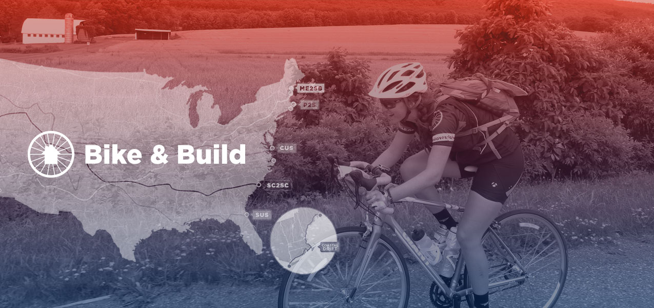
Bike & Build
Here’s how Mightybytes worked with a national cycling nonprofit to redesign their website and improve registration and donation processes.
Bike & Build engages young adults with affordable housing issues through cross-country bike trips that include a peer-to-peer fundraising component. Out of necessity, due to limitations of their outdated existing system, the organization devised numerous time-consuming workarounds in order to get the data needed to successfully run their events, which was laborious and expensive. The team at Bike & Build asked Mightybytes to help them with a complete redesign and rebuild for both the user-facing website and the administrative rider/donor management platform.
Their original plan was to rebuild the rider/donor management platform first then redesign the website. However, the work performed in our collaborative discovery sessions led us to identify and reprioritize Bike & Build’s goals. Since the website was top of funnel for donations and potential riders, everyone agreed it would be best to redesign the user-facing site first with the goal of increasing application and donation rates.
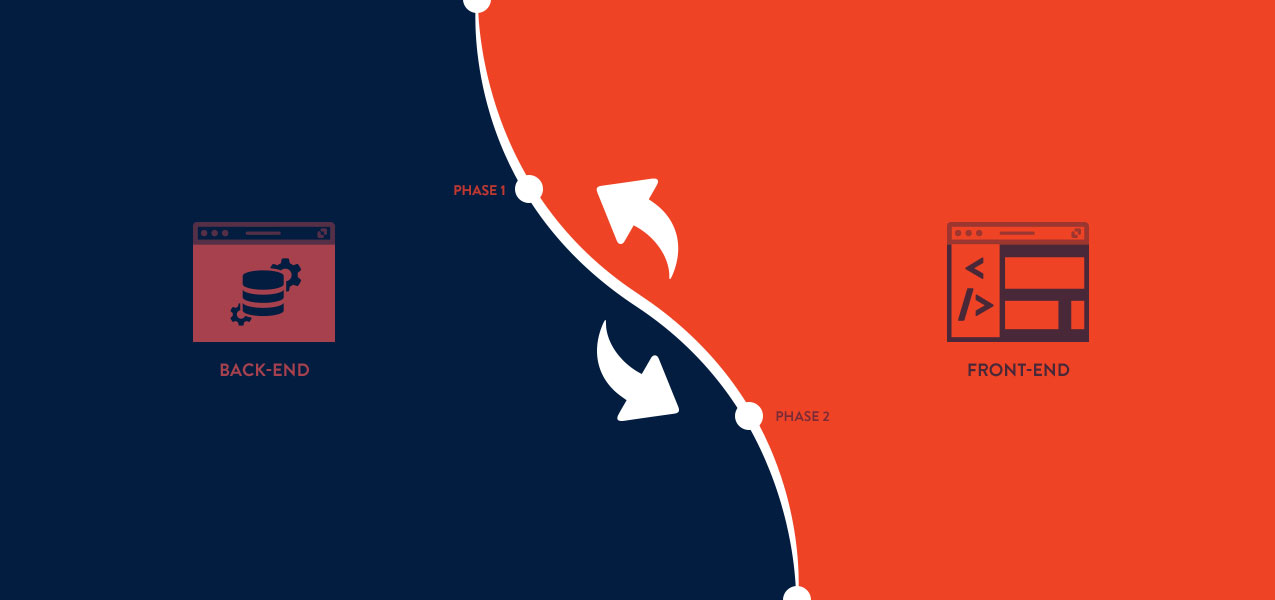
Phase One
Bike & Build’s website was full of great information and compelling stories, but visitors had trouble finding what they needed because the navigation was confusing: there were no clear calls-to-action, and the design was not responsive on mobile devices. The first step to improve their confusing user experience was to identify primary site users and desired actions the organization wanted those users to take. For Bike & Build, there were two primary user types:
- Potential riders registering for an event
- Potential donors contributing to a rider’s fundraising goal
These core user groups informed every aspect of our information architecture and user experience design work for phase one.
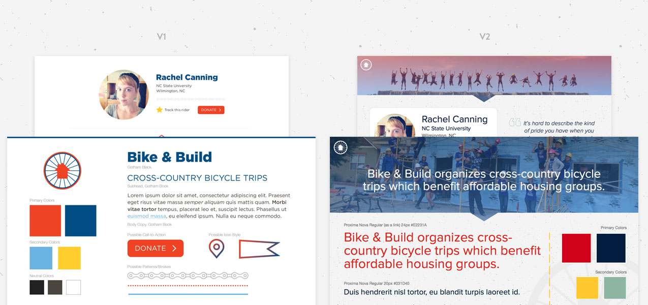
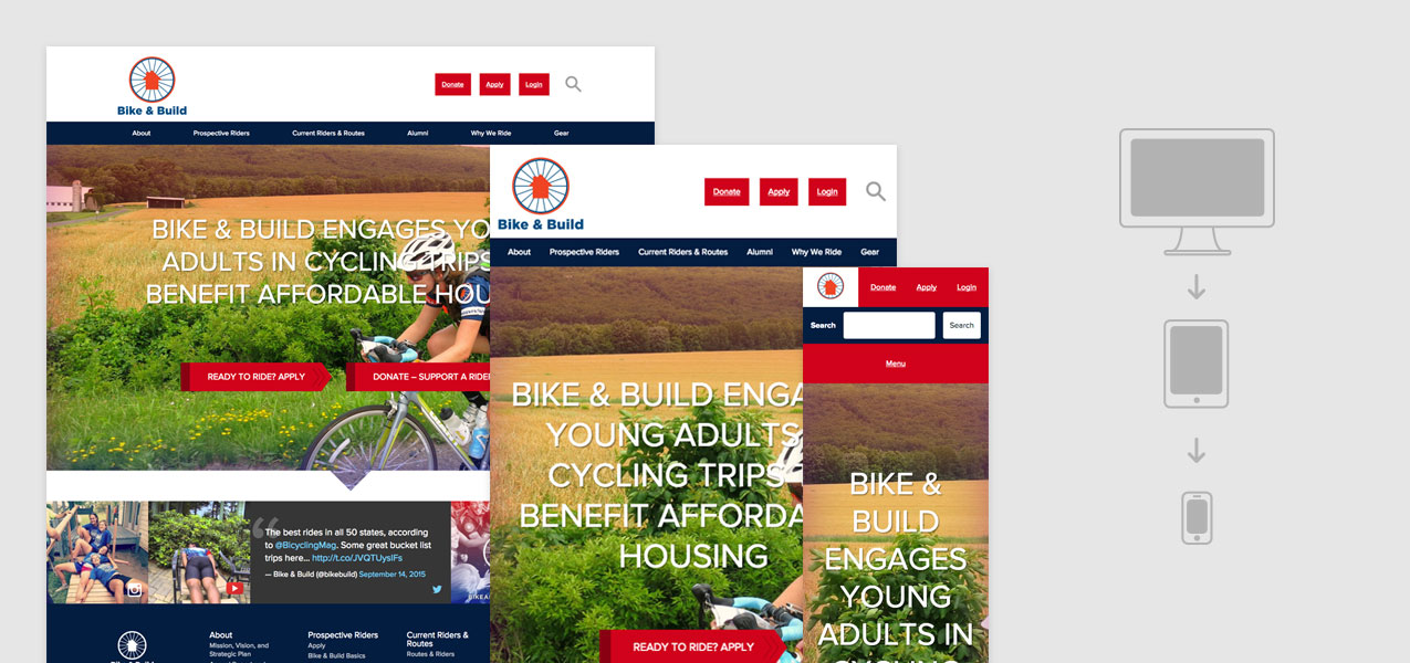
The new Bike & Build user experience clearly communicates the organization’s value proposition, and makes it easy for potential riders and donors to find the right path through the site’s content. The visual design tells a compelling story about rider impact through beautiful imagery and testimonials from past riders. Because the new website is responsive, visitors are treated to a great experience no matter the device they use.
Phase Two
With a great experience in place, we set ourselves to figuring out how Bike & Build could reimagine its donation and registration management experience for both front-end users and employees who needed to administer the system. On the front-end, users were uploading PDF files to apply for a Bike & Build event and donations were handled through an offsite third-party system, which was far from optimal. Plus, no user account system meant past riders had to re-register every year, even if they had participated in a previous event. On the back-end, admins relied on circuitous workarounds to manage registrations and donations, many of which involved a blend of both online and offline processes that took up lots of time and cost the organization money.
We began this phase by analyzing the organization’s current needs and listening to their pain points and the details of each workaround. Through collaboration with key stakeholders, we created ideal workflows for each user type and identified specific user stories to bring those features to life. We used agile methods to prioritize each story so focus was spent creating deliverables with highest value first. We then delivered features in iterative, agile sprints. Rigorous user testing at key points during sprints helped ensure what we built was aligned with the needs of all stakeholders: potential riders and donors as well as back-end admins.
The result was a custom Laravel application that fits Bike & Build’s actual needs without relying on workarounds and seamlessly integrates with Paypal for donations and registration costs. For front-end users, the software we built allows participants to incrementally work on their application and receive feedback from Bike & Build staff during the process. On the back-end, site admins have much improved custom dashboards to help them easily find relevant information needed to manage the organization’s business transactions online.

