Chicago Children’s Choir
Mightybytes spent time upfront to understand our organization’s mission and goals, which really helped us stay focused during the website redesign process. The new site is already paying dividends and we look forward to it helping us grow and make a greater impact in the community.
Dave Adams | Director of Marketing and Communications | Chicago Children’s Choir
Chicago Children’s Choir worked with Mightybytes to transform an outdated and non-responsive website into a useful business tool that serves donors, parents, and other organizational stakeholders.
Chicago Children’s Choir unites youth from diverse backgrounds to become global citizens through music. Their mission is to inspire and change lives. In anticipation of the choir’s 60th anniversary, the organization sought to update its website in time for their annual gala benefit. The existing site was outdated both in terms of visual appeal and content. It also didn’t work well on mobile devices. These challenges made it difficult to serve donors who wanted to support the Choir, and parents who wanted to keep track of rehearsal schedules for more than 4,300 children. Chicago Children’s Choir partnered up with Mightybytes to solve these and other challenges.
Goal Setting and Consensus Building
We began the website redesign process with a facilitated discovery workshop where project stakeholders discussed organizational goals and target audience. This helped us build consensus on how a new website would best serve the intersection of user needs and the Choir’s business goals. During this workshop, we ran several collaborative exercises to bring further clarity to these goals and how we would achieve them.
Ecosystem Mapping
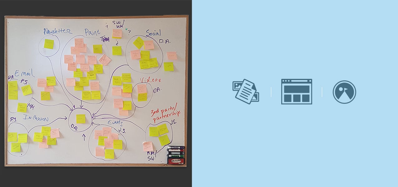
Because websites do not exist in isolation within an organization or on the internet, it was valuable for the Choir to explore what other channels were in place to deliver their message. Through this mapping exercise, we looked at not only the Choir’s digital tools like social media and email newsletters, but also their physical touchpoints like flyers, in-person events, and so on. By listing multiple ways the Choir interacts with their audience, we helped their team better understand how a website could be more strategically focused. This in turn helped us collectively identify site-specific goals to meet.
Audience Personas
Using website-specific goals we worked with the Choir to identify and rank the appropriate audiences most likely to utilize the website: individual donors, parents, and corporate sponsors. We then matched these user personas with specific website goals. For example, the Choir relies on contributions of all sizes, so giving users a clear path to donate was a high priority. They also identified that the best time to convert a person to a donor is while that person attends an event hosted by the Choir. Therefore, the display of upcoming events was also a top priority for the redesign.
Mood Cards and Style Tiles
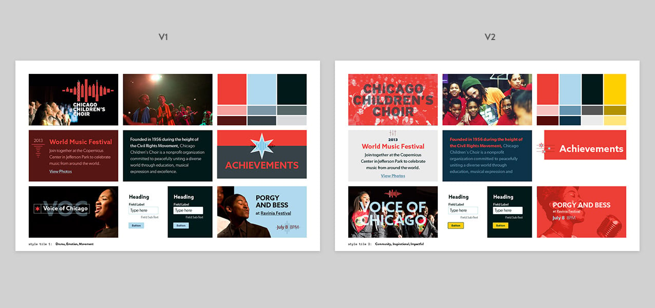
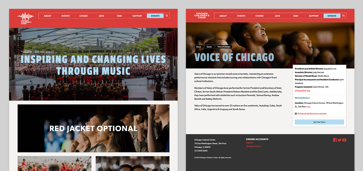
The Choir rebranded with a more modern look and feel and their new brand guidelines came with mockups for branding physical products like flyers and brochures, but were lacking in guidelines specific to digital assets. We used mood cards, which showed various design elements from other websites and digital products, to determine design assets that were appealing to the Choir. During this exercise we learned about the Choir’s extensive photo library, which helped us devise a design direction driven by bold imagery and clear headings. These were delivered to the Choir team as style tiles. In these deliverables, we explored the idea of introducing a fourth color to their palette, but ultimately stuck with their original three colors of red, light blue, and black.
Content Audit and Information Architecture
Using a content audit to drive the new site’s information architecture, we uncovered many insights. Since the Choir had some internal limitations on content governance, we were able to help them cut many existing pages that didn’t meet user needs. We retooled the site’s navigation and information architecture to focus on the primary actions users perform: join, hire, support, and donate. During this process, we also identified events as the most important content type. This content was often obscured under the nebulous category of “experience” so we labeled this section as “events” to help users more easily find content.
Component Prototypes
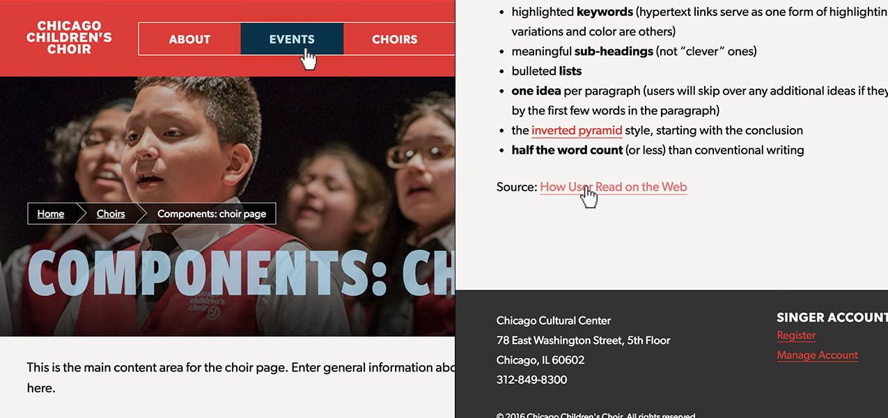
Since shifting to a design process driven by component design, we provide our clients with much more flexible design solutions that can scale as their needs do. By designing components around common content types, clients can mix and match to create unique, custom page layouts, which can be challenging when using more rigid page templates. After assessing common patterns across all the Choir’s site pages we created prototypes that the client could interact with and review. Since these were designed in the browser using HTML and CSS, client change requests could be made quickly and reflected across all components. When we integrated the approved prototypes with WordPress, we made each component available on every post type. This gave Chicago Children’s Choir maximum flexibility for creating future page layouts without having to call Mightybytes every time they wanted to do so.
Content Production Management
Given the tight launch deadline and amount of outdated content on the existing site, it was crucial for Chicago Children’s Choir to clearly understand how the content production and governance process works so they could allocate an appropriate amount of resources to stay on track. Mightybytes hosted a content production workshop to train their team on a typical workflow as well as identify the Choir’s unique needs and challenges.
One insight that arose during this workshop was that the Choir lacked a central location to create or revise content outside of the site. We trained them on a tool called GatherContent, which gives users the ability to assign pages to individuals and create deadlines. Using GatherContent they could also create and edit site content long before their new content management system was ready to accept it. This helped the Choir team implement the production process outlined in our workshop and create content without significant delays to the overall project.
WordPress Training
As the site launch date neared, we conducted a WordPress training session to help Chicago Children’s Choir team clearly understand how best to use their new tools. This was especially helpful for getting them up-to-speed on efficiently managing site components and empowering them to design future custom pages on their own.
Results
Chicago Children’s Choir announced the new website just prior to their annual Red Jacket Optional gala, which had a fundraising goal of $1M. They created a new page dedicated to streaming the event performance, which ended up raising $1.2M. Bounce rates on mobile devices have significantly decreased since launch. Plus, the Choir team now has a flexible and scalable content management solution that helps them more easily tell their story and engage donors, parents, and sponsors. This saves them time and money while empowering them to grow the organization.

