Susan Crown Exchange
Our project included numerous stakeholders spread across the country. The Mightybytes team did a great job organizing all the moving pieces and keeping everyone aware of what they were responsible for, and when. We now have an extensive resource to help educators include 21st century digital learning skills into their curriculum.
Haviland Rummel | Executive Director | Susan Crown Exchange
The Susan Crown Exchange (SCE) supports innovation and educational ecosystem advancement through digital learning. Their goal is to arm rising generations with 21st century skills. They asked Mightybytes to help them meet this goal with an information portal for researchers and educators.
SCE teamed up with University of California – Irvine and several other educational partners on the Digital Learning Challenge, an extensive research project that identifies how young people use digital tools to enhance learning. To share this research with the global education community, they needed a digital product that could help educators and administrators find resources and improve educational programs. This product must present information in an easy to digest and relatable format while also getting users excited about the possibilities of digital learning.
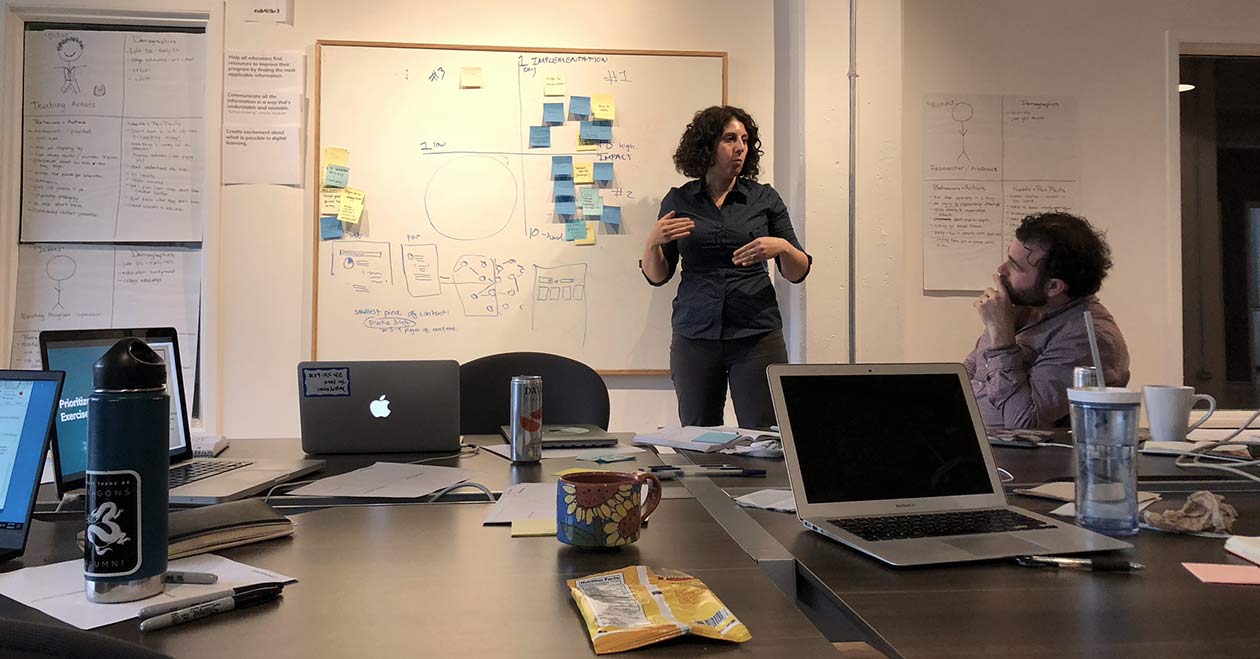
Collaborating on Project Goals
Designing features to help educators maximize utility from this digital product was our top priority. How could we help target users quickly identify resources to help them improve their educational programs?
During product roadmapping with key project stakeholders, we collectively identified the following goals:
- This product would be a central information portal for SCE and partners to share the fruits of their Digital Learning Challenge research with educators.
- Intuitive navigation was key: information must be easy to find.
- Clear messaging should highlight important components of the Digital Learning Challenge.
- Strong branding and visual identity should make the value proposition clear and easy to understand.

User Research
We conducted an online survey to learn what types of content target users—researchers, program facilitators, policymakers, parents, and educators alike—really wanted. This revealed several key insights:
- Funding, time, and knowing where to look impeded users’ ability to find digital learning materials.
- Target users relied on personal contacts, the internet, and educational groups to learn about new programs and practices.
- Lesson plans, case studies, and video tutorials were preferred content types.
This research validated that a search engine-friendly information portal with free case studies and other learning resources could be valuable to our target audience.
Designing Intuitive Navigation
One of the project’s primary challenges was the volume of information related to this research. Users needed ways to quickly identify where they could find information related to their specific needs. Two primary sections organize information into “Topics” and “Resources”.
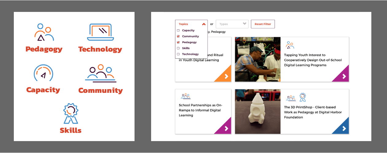
Under Resources, users can filter by specific topics and types, such as case studies or how-to tutorials. The Topics section allows users to hone in on one of five strategic sub-sections, such as pedagogy, technology, or skills, to access resources in that category. A search feature also helps users find information related to specific keywords.
Managing Content
This project was driven by research that resulted in significant amounts of content. It also included various stakeholders in multiple time zones across the United States. To manage all of this, we customized GatherContent, which helped us coordinate efforts and facilitate collaboration with stakeholders. Because GatherContent allowed us to organize content types that mirrored the eventual site structure, we could get started early on content collection, creation, and curation, which allowed us to maintain content deadlines across the overall project schedule.
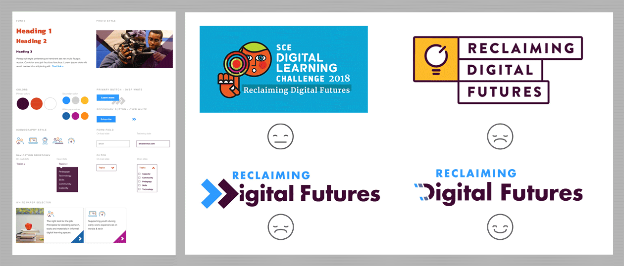
Brand Consistency Across Products
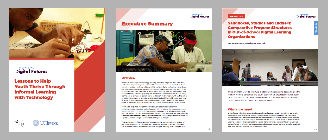
While the website served as the primary channel through which to convey this program’s value proposition, SCE wanted consistency across web and print products. To brand the entire program, Mightybytes created a Reclaiming Digital Futures logo, brand guidelines, and a 187-page downloadable report of the initiative’s findings, which helped SCE reach its goal to maintain strong branding throughout the project.
Setting up for Future Success
At launch, we gave SCE and partners tools to track site performance and check which topics and resources are the most popular. This intelligence allows them to modify site content to best suit audience needs and helps them realize their goal of appealing to visitors from both urban and rural areas.

